Templates Reference
Templates are the basic building blocks of Instant Answer displays. Below is a detailed reference of the properties and usage of each.
To understand the context of templates and how they fit into your Instant Answer, start with the Templates Overview.
Important Note
Before using these templates please familiarize yourself with the Instant Answer display options (for example, Spice or Goodie) document to understand the proper usage of both the templates block and the options block. Understanding these is crucial to implementing templates properly and effectively.
You will be specifying these templates indirectly - as part of a Template Group. The Templates Groups Overview will help you think about the big picture of which template groups best fit your Instant Answer.
Templates
The list of built-in templates includes:
text_itemtext_detailbasic_image_itemproducts_itemproducts_detailproducts_item_detailbasic_icon_detailbasic_info_detailplaces_itemplaces_detailbasic_flipping_itembase_flipping_itemlist_detailrecordmedia_itemmedia_item_detailimages_itemimages_detailvideos_itemvideos_detailbase_itembase_detail
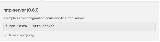
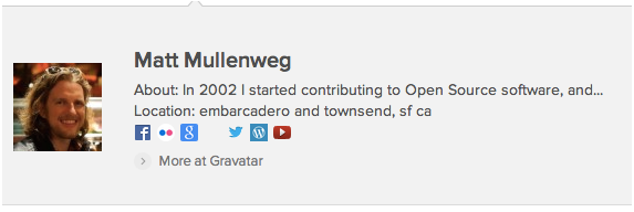
text_item Template
Template for displaying textual information tiles, each with an optional icon.
Template Diagram

+------------------+
icon
title, altSubtitle
subtitle
description
footer
            dateBadge
+------------------+
Available Features
icon[optional] string urlURL path to icon image
url[optional] string urltitle[required] string urlaltSubtitle[optional] string or string arraysubtitle[optional] string or string arraydescription[required] stringfooter[optional] sub-templatedateBadge[optional] objectAn object with either a
textstring property or amonthanddaystring properties. For an example of this property in action, search for "concert in toronto" and see the SeatGeek Events by City Spice.
Example Usage
Template Groups
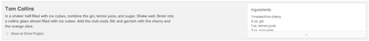
text_detail Template
A template for displaying textual information detail, with no image or icon.
Template Diagram
+-------------------------------------+

title_content or title
subtitle_content or subtitle
content

+-------------------------------------+
Available Features
title_content[optional] sub-templatetitle[optional] stringAvailable only if
title_contentis not specifiedsubtitle_content[optional] sub-templatesubtitle[optional] string or string arrayAvailable only if
subtitle_contentis not specifiedcontent[optional] sub-template
Example Usage
Template Groups
basic_image_item Template
A tile template where images are the main feature, accompanied by text.
Template Diagram

+------------------+
image
title
description
rating
ratingText
+------------------+
Available Features
url[optional] string urlimage[required] string urlURL path to image
title[required] stringdescription[optional] stringLimited to 56 characters, truncated to whole words with an ellipsis
rating[optional] floatA positive float with one decimal point, up to 5.0
ratingText[optional] string
Example Usage
Template Groups
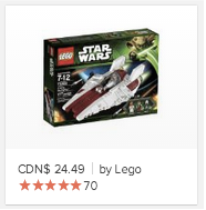
products_item Template
A tile item template where images are emphasized, with features suited for items that can be purchased.
Template Diagram
+------------------+
img
title
price
brand
rating
+------------------+
Available Features
url[optional] string urlimg[required] string urltitle[required] stringprice[optional] stringbrand[optional] stringrating[optional] floatA positive float with one decimal point, up to 5.0
reviewCount[optional] integerThe count of reviews Automatically formatted to include comma thousands separators
url_review[optional] stringURL path to reviews
Example Usage
Template Groups
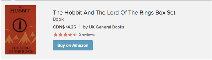
products_detail Template
A detail template where image is emphasized, suited to feature for an item that can be purchased.
Template Diagram

+------------------------------------+
                heading
                rating, reviewCount
                price, brand
    img         subtitle_content
                abstract
                buy
+------------------------------------+
Available Features
img[optional] string urlURL path to image
url[required] string urlheading[required] stringrating[optional] floatA positive float with one decimal point, up to 5.0
reviewCount[optional] integerThe count of reviews Automatically formatted to include comma thousands separators
price[optional] stringbrand[optional] stringsubtitle_content[optional] sub-templateabstract[required] stringLimited to 400 characters, truncated to whole words with an ellipsis
buy[optional] sub-templateCan be used to provide a call-to-action, such as a button.
Example Usage
Template Groups
products_item_detail Template
A template for drilling-down into a particular item on the same page. Emphasizes an image, and suited to feature for an item that can be purchased. This template features an optional call-to-action.
Template Diagram
+------------------------------------+
                heading
                price, brand
    img_m       subtitle_content
                rating, reviewCount
                abstract
                buy
+------------------------------------+
Available Features
img_m[optional] string urlURL path to image
heading[required] stringurl[required] string urlprice[optional] stringbrand[optional] stringsubtitle_content[optional] sub-templaterating[optional] floatA positive float with one decimal point, up to 5.0
reviewCount[optional] integerThe count of reviews Automatically formatted to include comma thousands separators
url_review[optional] string urlLink to source reviews page
abstract[required] stringbuy[optional] sub-templateCan be used to provide a call-to-action, such as a button.
Example Usage
Template Groups
basic_icon_detail Template
A template for displaying textual information detail, with a small image, icon, or character badge.
Template Diagram

+------------------------------------------------+
image and/or badge      title
                        subtitle
                        altSubtitle

                        content *or* description

+------------------------------------------------+
Available Features
image[optional] string urlURL path to image
badge[optional] stringtitle[optional] stringsubtitle[optional] string or string arrayaltSubtitle[optional] string or string arraycontent[optional] sub-templatedescription[conditional oncontent] stringAvailable and required if
contentnot specified
Example Usage
None - yet
Template Groups
basic_info_detail Template
A detail template which shows in-depth information. This template includes an auxiliary area for listing properties.
Template Diagram
The same template, with the aux feature:
+-------------------------------------------------------+
                title
    image       subtitle
                content or description          infoboxData
+-------------------------------------------------------+
Available Features
url[required] string urlimage[optional] string urlURL path to image
title[optional] stringsubtitle[optional] string or string arrayAvailable only if
titlespecifiedcontent[optional] sub-templatedescription[conditional oncontent] stringAvailable and required if
contentnot specifiedinfoboxData[optional] arrayAn array of objects used to render an InfoBox
Example Usage
Template Groups
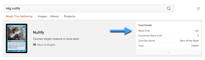
The Infobox
In the basic_info_detail template, the InfoBox floats on the right side of the AnswerBar. It presents detailed information in a table of key-value pairs:
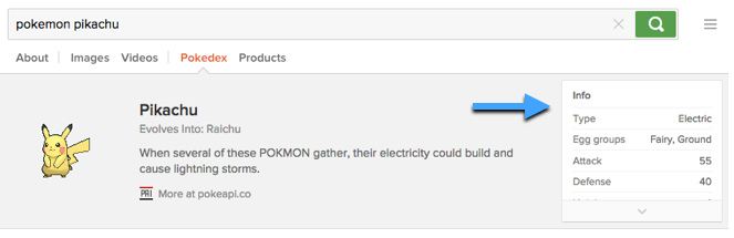
To display the InfoBox in the basic_info_detail template, an item must have an infoboxData property specified. This is an array of objects, each with the following properties:
label[required] stringurl[optional] string urlUsed to turn
labelelement into a linkvalue[optional] string or arrayUse array to display nested properties)
The first object in the array can also be used solely to specify a heading for the InfoBox. This object would contain only one property:
heading[optional] stringSpecified in its own separate object, first in the array
For example, when "mtg nullify" is searched, mtg.js dynamically generates the following array for infoboxData:
[
    {
        heading: "Card Details"
    },
    {
        label: "Mana Cost",
        value: "UU"
    },
    {
        label: "Converted Mana Cost",
        value: 2
    },
    ...
]
This data shows up in the AnswerBar, to the right:
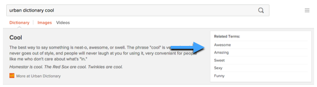
It is also possible to specify labels alone, with or without urls. This is the infoboxData value generated by urban_dictionary.js when searching for "urban dictionary cool":
[
    {
        heading: "Related Terms:"
    },
    {
        label: "Awesome",
        url: "https://duckduckgo.com/?q=ud+awesome&ia=dictionary"
    },
    {
        label: "Amazing",
        url: "https://duckduckgo.com/?q=ud+amazing&ia=dictionary"
    },
    ...
]
This appears as:
InfoBox Nested Properties
The value property of infoboxData objects can also be passed an array of objects. These objects have the following properties:
label[required] stringvalue[required] string
For example, the resulting array passed to infoboxData could be structured this way:
[
    {
        heading: "About Me"
    },
    {
        label: "My Favorites",
        value: [
            {
                label: "Color",
                value: "Red"
            },
            {
                label: "Animal",
                value: "Duck"
            },
            ...
        ]
    },
    ...
]
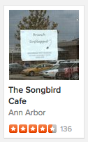
places_item Template
An item template which displays multiple location results on one map.
Clicking a places item both indicates its location on a map, as well as 'flips' the item to display more detailed information. The places_item template can conceptually be divided into its 'front' and 'back'.
Template Diagram
'Front'
+--------------------+


        image


+--------------------+
name
ratingImageURL *or* rating
reviews
+--------------------+
'Back'
This view is displayed when the 'front' is clicked, together with the map (below).
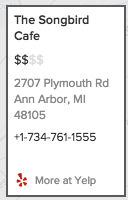
+--------------------+

name (url)

price

address_lines *or* address

phone

+--------------------+
Available Features
'Front' of each item:
image[optional] string urlPath to image
name[required] stringtitle[optional] stringAvailable only if
imagespecifiedratingImageURL[optional] string urlrating[optional] floatA positive float with one decimal point, up to 5.0 Available only if
ratingImageURLis not specifiedreviews[optional] integerThe count of reviews Automatically formatted to include comma thousands separators
'Back' of each item: (displayed upon click)
name[required] stringurl[required] string urlprice[optional] integerInteger between 1 and 4; converted to a dollar-sign rating (such as '$' or '$$$$')
address_lines[optional] arrayAn array of strings, one for each line
address[optional] stringAvailable only if
address_linesnot specified Limited to 65 characters, truncated to whole words with an ellipsisphone[optional] string
Map View
This view is displayed when the 'front' is clicked, together with the 'back' (above).
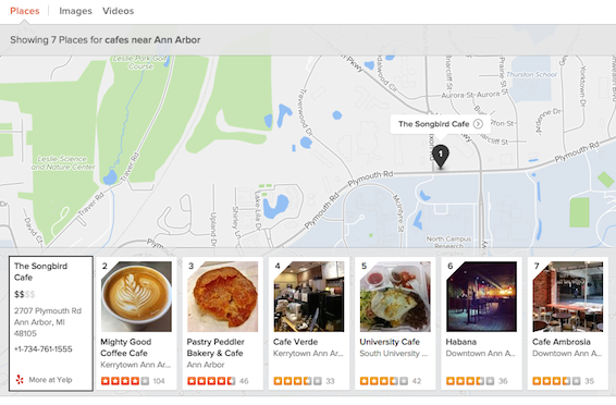
Example Usage
- Local results (built-in to DDG): search for cafes near Ann Arbor.
Template Groups
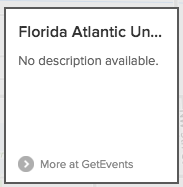
basic_flipping_item Template
This template is used to replace places_item on the front and back of the item tile, when using the Places template group. This template maintains the unique 'flip' behavior of places_item, but allows.
Template Diagram
'Front'
These properties are passed to the template inside a data_front object (e.g. data_front.title).
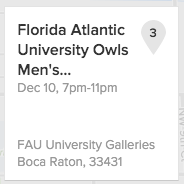
+--------------------+


    icon
    title, altsubtitle
    subtitle
    footer_content


+--------------------+
'Back'
This view is displayed when the 'front' is clicked, together with the map (below). These properties are passed to the template inside a data_back object (e.g. data_back.title).
+--------------------+


    icon
    title, altsubtitle
    subtitle
    footer_content


+--------------------+
Available Features
'Front' of each item:
These properties are passed to the template inside a data_front object (e.g. data_front.title).
icon[optional]title[optional]altsubtitle[optional]subtitle[optional]footer_content[optional] sub-template
'Back' of each item: (displayed upon click)
These properties are passed to the template inside a data_back object (e.g. data_back.title).
icon[optional]title[optional]altsubtitle[optional]subtitle[optional]footer_content[optional] sub-template
Interactions in the Places Template Group
When used with the Places template group, the behavior is similar to the default places_item: when the 'front' is clicked, the map displays, as does the 'back'.
Before click:

After click:
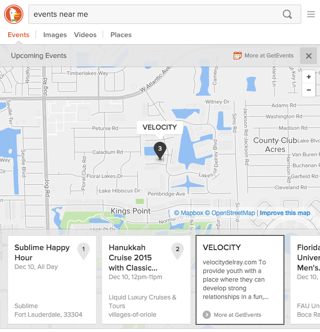
Example Usage
GetEvents: search for events in new york
In
get_events.js, theplacestemplate group is specified, and overrides theitemtemplate.templates: { group: 'places', item: 'basic_flipping_item' }The
normalizefunction returns the data for each side, contained within thedata_frontanddata_backproperties:return { data_front: { showPin: true, title: item.name, venue: item.venue, image: item.image_large_url, altSubtitle: formatSubtitleString(item), footer_content: Spice.get_events.foot_front, footLines: '4', titleClass: 'tile__title--3 tx--16 tx--bold mg--none', altSubClass: 'tx--13 tx-clr--grey' }, data_back: { title: item.name, url: buildUrl(item.id), description: item.description ? DDG.strip_html(item.description) : 'No description available.', footer_content: Spice.get_events.foot_back, titleClass: 'tile__title--1 tx--16 tx--bold' }, city: item.venue.city, place: item.venue.name, lat: item.venue.lat, lon: item.venue.lng };
Template Groups
- Used with Places
base_flipping_item Template
This template is used to replace places_item with custom sub-templates for the front and back of the item tile. This template maintains the unique 'flip' behavior of places_item, while allowing full customization of both sides.
Use as a last resort because of the large amount of upfront work and ongoing maintenance involved with fully-custom html.
It's important to note that the community cannot accept submissions using this template unless they've received prior permission (by discussing with community leaders or staff on Slack or email). If you feel that other templates do not meet your needs, definitely talk to us. We'll work with you to find the best way to express your idea and avoid ongoing, manual maintenance for your Instant Answer.
Template Diagram
'Front'
+--------------------+


    front_content


+--------------------+
'Back'
This view is displayed when the 'front' is clicked, together with the map (below).
+--------------------+


    back_content


+--------------------+
Available Features
'Front' of each item:
front_content[required] sub-template
'Back' of each item: (displayed upon click)
back_content[required] sub-template
Map View
As with places_item, map view is displayed when the 'front' is clicked, as it displays the 'back'.
Example Usage
Parking Panda: search for parking in new york.
In
parking.js, theplacestemplate group is specified, and override theitemtemplate. Then the two custom sub-templates are specified underoptions.templates: { group: 'places', item: 'base_flipping_item', options: { front_content: Spice.parking.item_front, back_content: Spice.parking.item_back } }
Template Groups
- Used with Places
places_detail Template
A detail template for displaying information about a single location on a map backdrop.
Template Diagram
+--------------------------------+------------+
|   name (url)                   |            |
|                                | image (url)|
|   ratingImageURL *or* rating   |            |
|   reviews                      |            |
|   price                        |            |
|   address_lines *or* address   |            |
|   phone                        |            |
|                                |            |
|                                |            |
+--------------------------------+            |
|                                |            |
|    hours                       |            |
|                                |            |
+--------------------------------+------------+
Available Features
url[required] string urlname[required] stringimage[optional] string urlURL path to image
title[optional]Used at
altattribute of theimageelementhours[optional] arrayArray of objects, each containing
dayandhourspropertiesratingImageURL[optional]rating[optional] floatA positive float with one decimal point, up to 5.0 Available only if
ratingImageURLnot specifiedreviews[optional] integerThe count of reviews Automatically formatted to include comma thousands separators
price[optional] integerInteger between 1 and 4; converted to a dollar-sign rating (such as '$' or '$$$$')-
address_lines[optional] arrayAn array of strings, one for each line
address[optional] stringAvailable only if
address_linesnot specifiedphone[optional] string
Example Usage
- Local results (built-in to DDG): search for a particular business.
Template Groups
list_detail Template
A detail template for displaying of a title and subtitle above a bulleted list, or a table of key-value pairs.
Template Diagram
+-------------------+

title
subtitle

content, record_data
*or*
list_content, list

+-------------------+
Available Features
title[optional] stringsubtitle[optional] string or string array
If Displaying Table of Key-Value Pairs:
content[required] sub-templateRecommended to set this value to
'record'(a string) to specify the built-inrecordsub-template. Learn more about built-in sub-templates.record_data[required] objectIncludes the key-value pairs to display
If Displaying Bulleted List of Values:
list_content[required] sub-templateSupply a custom handlebars sub-template. The sub-template will be rendered, enclosed by a
lielement. Learn more about sub-templates.listarrayArray of objects, each contains the properties used by
list_contentsub-template
Usage
To display a bulleted list, pass a sub-template to the list_content property. To display a table of key-value pairs, pass the record template to the content property.
When displaying a bulleted list, the simplest case would be to pass list an array of objects like {value: 'foo'} and specify list_content to be a sub-template which only reads {{value}}.
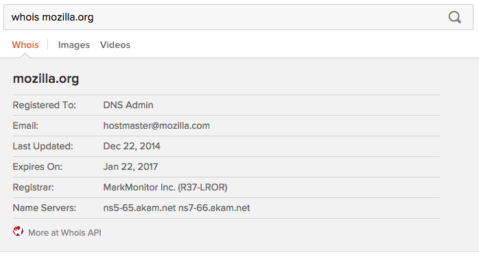
Example Usage
- Whois (search for 'whois mozilla.org')
Template Groups
record Template
A special template that is ideal for key-value data. It generates a <table> where each row contains a key and value. Often used as a sub-template, for example by the list_detail template.
Template Diagram
+---------------------------------------------+
*key*           *value*
*key*           *value*     (of record_data)
*key*           *value*
...
+---------------------------------------------+
Available Features
record_data[required] objectContains key-value pairs to display in table format Values limited to 350 characters, truncated to whole words with an ellipsis
Usage
This template requires that a record_data property, which should contain the key-value data to be displayed. All the properties of the record_data object will be used as the keys for the table.
However, if you want to specify exactly which properties of the record_data object should be displayed, you can define an optional record_keys property. This is an array of strings, specifying which key-value pairs of record_data will be included.
An optional property called rowHighlight can be added to options to turn on alternating row highlighting.
Sample Code
data: {
    record_data: {
        name: 'Bob',
        phone: '123-456-7890',
        email: 'bob@bobstheman.com',
        address: '123 First Street'
    }
},
normalize: function(item){
    return {
        record_keys: ["name", "phone", "email"]
    }
},
templates: {
    group: 'base',
    options: {
        content: 'record',
        /* optional - highlight alternate rows */
        rowHighlight: true
    }
}
Example Usage
Template Groups
- Can be used as a sub-template by the List template group (under the
list_detailtemplate)
media_item Template
Template Diagram
+----------------------+

        image


title
altSubtitle
subtitle
description

footer        dateBadge

+----------------------+
Available Features
title[required] stringaltSubtitle[optional] string or string arraysubtitle[optional] string or string arraydescription[optional] stringfooter[optional] sub-templatedateBadge[optional] objectAn object with either a
textstring property or amonthstring anddaystring properties. For an example of adateBadgein action, search for "concert in toronto" and see the SeatGeek Events by City Spice. (The example uses thetext_itemtemplate, but the dateBadge is the same.)
Example Usage
Template Groups
media_item_detail Template
Template Diagram
+------------------------------------------------------------------+
                        title, altSubtitle
    image                subtitle
                        description
                        callout
+------------------------------------------------------------------+
Available Features
image[optional] string urltitle[required] stringaltSubtitle[optional] string or string arraydescription[optional] stringcallout[optional] sub-templateCan be used to provide a call-to-action, such as a button.
Example Usage
Template Groups
images_item Template
Template Diagram
Regular State
+-------------------+

    thumbnail

+-------------------+
Hover State
+-------------------+

   width × height

+-------------------+
Available Features
thumbnail[required] string urltileWidth[required] integerThe pixel width of the thumbnail image - may vary among tiles
title[optional] stringThe
althtml attribute of the image elementwidth[required] integerThe pixel width of the original image.
height[required] integerThe pixel height of the original image.
Example Usage
- Search for "duck images" (built-in images Instant Answer)
Template Groups
images_detail Template
Template Diagram
+------------------------------------------------------------------+


    thumbnail                   title
    or                          url
    highResImage                width × height
                                image

+------------------------------------------------------------------+
Available Features
thumbnail[required] string urlhighResImage[optional] string urltitle[required] stringurl[required] string urlPath to image source page (the page on which the image was originally embedded)
width[required] integerThe pixel width of the original image.
height[required] integerThe pixel height of the original image.
image[required] string urlPath to image source file (the original image file path)
Example Usage
- Search for "duck images" and click on any item (built-in images Instant Answer)
Template Groups
videos_item Template
Template Diagram
+----------------------+

    images.medium

    duration


    title
    viewCount

+----------------------+
Available Features
images[required] objectObject with paths to various image sizes. This template requires a
mediumproperty.duration[required] string urlDuration of the video, in HH:MM:SS format (e.g. '5:32' or '2:01:59')
title[required] stringviewCount[required] stringNumber of video views, preferably with commas as the thousands separator (value not formatted automatically)
Example Usage
- Search for "gopro videos" (built-in videos search)
Template Groups
videos_detail Template
Template Diagram
+------------------------------------------------------------------+


    [video content]             title
                                username
                                viewCount
                                published

+------------------------------------------------------------------+
Available Features
title[required] stringurl[required] string urlusername[required] stringviewCount[required] stringpublished[required] stringA date string in any format recognized by the JavaScript
Date.parse()method
Example Usage
- "gopro videos" and click on any item (built-in videos Instant Answer)
Template Groups
base_item Template
An item template for containing fully customized markup.
Use as a last resort because of the large amount of upfront work and ongoing maintenance involved.
It's important to note that the community cannot accept submissions using this template unless they've received prior permission (by discussing with community leaders or staff on Slack or email). If you feel that other templates do not meet your needs, definitely talk to us. We'll work with you to find the best way to express your idea and avoid ongoing, manual maintenance for your Instant Answer.
Template Diagram

+---------------------------------+


        content (template)


+---------------------------------+
Available Features
url[required] stringcontent[required] sub-template
Example Usage
Complex Example
Here is an example of a more complex content sub-template passed to the base_item template.
Template Groups
base_detail Template
A detail template for containing fully customized markup.
Use as a last resort because of the large amount of upfront work and ongoing maintenance involved.
It's important to note that the community cannot accept submissions using this template unless they've received prior permission (by discussing with community leaders or staff on Slack or email). If you feel that other templates do not meet your needs, definitely talk to us. We'll work with you to find the best way to express your idea and avoid ongoing, manual maintenance for your Instant Answer.
Template Diagram
+---------------------------------+


        content (template)


+---------------------------------+
Available Features
contentstring or sub-template
Example Usage
Complex Example